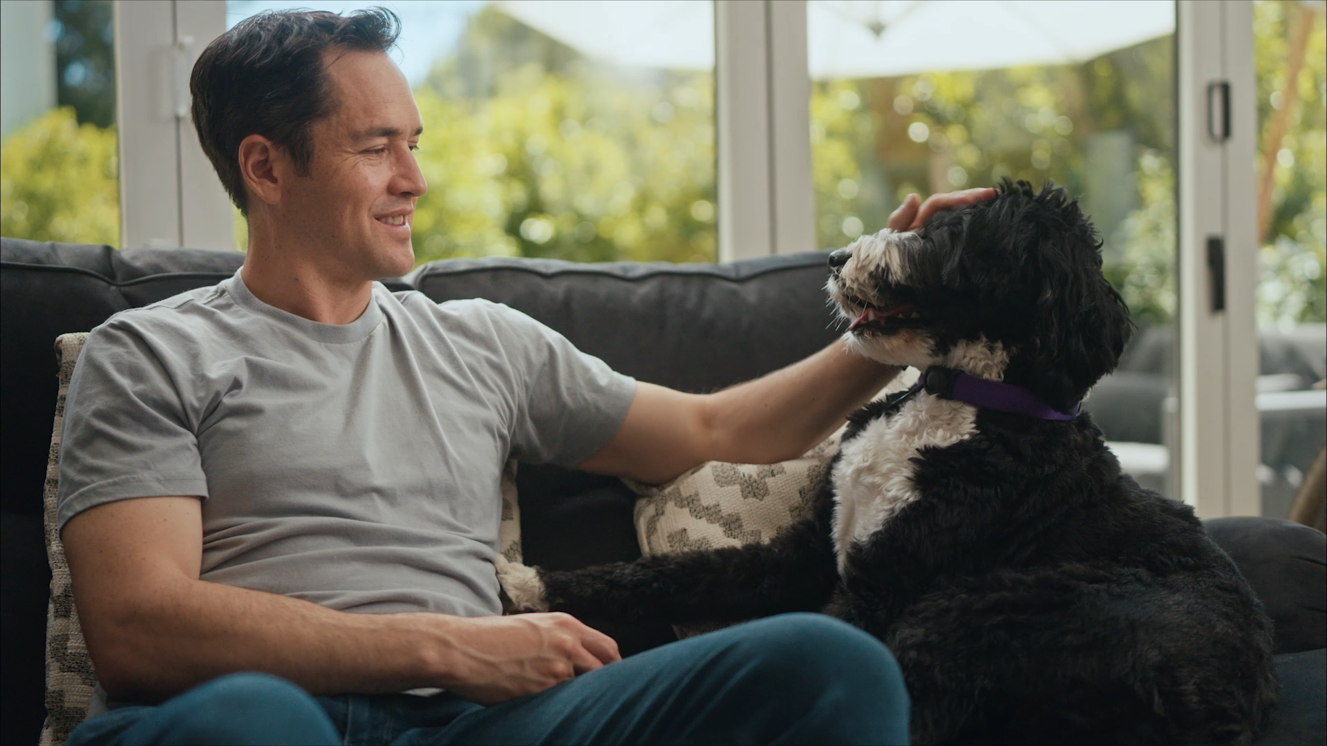
Life360
Highlight reel from 13-minute IPO film
Life360 IPO Roadshow film
Client:
Life360’s mission is to keep people close to the people, pets, and things they love through location sharing, item tracking, and a host of connectivity and safety features.
Role:
I served as Director for this project, leading creative direction from pre-production to post, and interfacing between the client executives, investment bankers, and the production team.
The Brief
Goals:
The primary goal was to get an investor audience excited about Life360’s public offering and position it as an appealing investment opportunity. It was important to communicate the benefits of the human connectivity provided by the Life360 experience to compel potential investors to learn more.
Audience:
The target audience was investors who are particularly interested in technology, social networks, and family safety and connectivity features. It was important to immediately dispel any misconceptions that Life360 is just a location tracking app and to ensure that viewers leave with a clear understanding of what Life360 is and what services they provide, in addition to their value proposition as an investment opportunity.
SCOPE:
The scope for this project included:
10-minute video
Basic graphics package with product animation add-on
26 days of total project timeline
1 executive interview shoot day
14 days of post-production
14 days w/ lead editor
7 days w/ lead motion designer
13 days w/ motion design assistant
1 day of color grade & post sound mix
Team: Account manager, production coordinator, producer, cinematographer, gaffer, post-producer, editor, 2 motion designers
Budget: $20,000-50,000
creative process
Research
My creative process started with a deep dive into researching the brand, company history, and online presence.
Messaging Brief
The next step was to align with the client’s executive and marketing team on the specific messaging and positioning envisioned for this video within their overall IPO strategy.
Creative treatment
I then synthesized the information gathered from the brand guidelines and creative exploration with the client stakeholders into a consolidated treatment, to get their final buy-in, which guided our look and approach, from production to post.
SCRIPTING
Finally, I edited their initial boilerplate investor script to infuse more brand language and personality, streamline content, and trim the length to fit our scope. The client stakeholders and I collaborated on the final few iterations which eventually became our shooting script. From there, we created a 2-column breakdown to guide the post-production process.
cinematography
Our overall lighting style and color grade was designed to create an elevated, premium look, while matching the existing brand footage that would be used as b-roll.
The shooting location was inside a home, which allowed us to leverage wide framing to capture the environment, creating a feeling of approachability and relatability, while reinforcing brand themes around everyday family life.
Composition and interview blocking was intentionally designed to integrate seamlessly with graphic overlays and transitions.
Interviews were filmed with 2 cameras for visual variety and flexibility in post. Our B-Camera was on a slider to create a feeling of momentum.
Opening gambit
The opening sequence was designed to hook the audience, convey brand personality, and clearly communicate crucial context around what Life360 is, at the very beginning of the video, before moving into the core interview content and investment pitch.
The gambit tells a story about how families use Life360 to facilitate more connection and peace of mind, while illustrating the emotional quality of the Life360 experience.
With a relatively minimal motion graphics budget, we strategically allocated resources in order to create a more robust opening gambit by simplifying the graphic reinforcements in the body of the video. Having a thoughtful approach helped add a bit more sizzle to the hook without causing the overall graphics to suffer.
containers & overlays
We created a graphic container treatment that would wrap around the interview subjects, to infuse a leveled up feeling to the animation, without expending much of the graphics scope.
We framed the interview footage so that the container could wrap around them, without needing to animated or reposition the interview footage itself. This meant that the container could simply be layered on top of the footage and duplicated throughout the timeline, removing any need for roundtrips between Premiere, After Effects, and Resolve. Small variations to the container animation were easy to make and helped keep the treatment from feeling repetitive.
Lastly, the shape of the container was consistent with the client’s other brand design elements, it was thematically appropriate by visually resembling phone screens, and the solid color background ensured text graphics would look clean and uniform.


